Most UX portfolios look the same. A hero image, a few screenshots, three paragraphs about "the problem," and a Figma embed. Recruiters scroll past dozens of these every week, and after a while they blur together. If you want to stand out, you need a way to show your thinking over time — not just the polished end product. That's where an interactive timeline comes in.
A UX portfolio timeline does something a case study can't easily do: it lets a hiring manager watch your project unfold. First research, then the messy middle, then the pivot, then the shipped feature. They can click, hover, expand, and explore at their own pace. It's a totally different experience from scrolling a static page, and it changes how people read your work.
Interactive timelines aren't just a nice-to-have for portfolio flair, either. They mirror how real product work actually happens. Hiring managers want to see your process. They want to see how you handle ambiguity, how you iterate, how you recover when user testing blows up your assumptions. A timeline formats that story in a way that's easy to follow and hard to ignore.
In this guide, I'll walk through why timelines work so well for UX portfolios, what to include, how to build one without losing your weekend, and the mistakes that make portfolio timelines feel gimmicky instead of impressive. I'll also show how a tool like Timeline Creator fits into the process, especially if you'd rather spend your time on content than on CSS.
Let's dig in.
Why Static Case Studies Fall Short
Before we get into timelines, it's worth being honest about what most UX portfolios get wrong.
A traditional case study usually follows a predictable arc. There's a title, a subtitle, some context, a few "insights," a bunch of screens, and a vague conclusion about "iterating based on feedback." The format is fine. It's also exhausted. Recruiters have read thousands of them. And because portfolios are usually built from a template or a site builder with limited layout options, they tend to look nearly identical across candidates.
Here's the thing: UX is a process discipline. The job is about making decisions over time — running research, testing assumptions, arguing for one direction over another, and shipping something that actually works. A static page compresses all of that into a before-and-after snapshot. It hides the most interesting parts of your work.
Interactive timelines fix some of this by giving your process a visible shape. Instead of a hero section and a wall of text, you get a chronological spine. Each stage of the project becomes a clickable node. Viewers can follow the story in order, jump to the parts they care about, and get a sense of how long things took.
There's also a practical recruiting angle. Most hiring managers spend 30 seconds to two minutes on a portfolio before deciding whether to keep reading. A timeline gives them a reason to stay. It's visual, it's scannable, and it signals that you put thought into how you present your work. That itself is a UX skill.
What Interactive Timelines Bring to a UX Portfolio
Timelines aren't just a visual gimmick. Done well, they add several things a static page can't.
Sequence and pacing. A timeline makes time visible. You can show a six-week sprint at a glance, or stretch a two-year product evolution across a horizontal scroll. Viewers instinctively understand sequence, which makes complex projects easier to absorb.
Context for each decision. Instead of dumping all your research into one section, you can place each insight at the moment it mattered. "We ran five user interviews in week one and found X, which led us to redesign Y." That's a much stronger narrative than listing findings out of order.
Scannability without losing depth. People can skim a timeline and still get the shape of the story. If they want more, they click into nodes for details. That's a nice balance for busy reviewers who want to see if you're worth a deeper look.
Multiple entry points. Some reviewers care about research. Others care about visual design or interaction details. A well-built timeline lets each of them find what they're looking for without forcing everyone through the same linear journey.
A natural home for rich media. You can embed prototypes, video walkthroughs, before-and-after comparisons, quotes from user testing, or screenshots of dead-end explorations. All of that fits into a timeline format without feeling scattered.
Team and stakeholder value. If you're presenting work to a client or an internal team, the same timeline you built for your portfolio can double as a project retrospective. That's efficient, and it means less duplicated effort when you're updating your portfolio after a project wraps.
If you've ever tried to write up a messy, non-linear project and felt like the case study format was fighting you, that's a sign a timeline might be a better fit.
The Anatomy of a Strong UX Portfolio Timeline
Not all timelines are created equal. Some look great but tell you nothing. Others are information-dense but impossible to scan. The best ones balance visual appeal with clarity.
Here's what a strong one usually includes.
A Clear Arc
Every good portfolio timeline has a beginning, a middle, and an end. Not literally — you don't need to include every day of the project — but a visible arc that moves from problem to solution. Reviewers should be able to describe your project in one sentence after looking at the timeline for 30 seconds.
A common structure looks like this:
- Context and problem — What was the situation? Who was affected?
- Discovery — What did you learn from research, data, or stakeholder interviews?
- Exploration — What directions did you try? What didn't work?
- Decision point — What choice did you make, and why?
- Build and test — How did the solution come together, and how did you refine it?
- Outcome — What shipped, and what happened?
You don't have to follow this exactly. Some projects are messier. But if your timeline skips the exploration phase, it's going to feel thin.
Visual Consistency
Your timeline should match the rest of your portfolio — same typography, same color palette, same general vibe. If your portfolio is minimal and quiet, your timeline shouldn't be a neon explosion. If your work is playful, though, lean into it. Consistency isn't about being boring; it's about not creating a jarring experience for the person reviewing your work.
Interactive Details That Earn Their Place
Interactivity is a tool, not a goal. Hover states that reveal captions? Great. Clickable nodes that open detailed case studies? Excellent. Animation that plays every time someone scrolls? Probably not. The best interactivity supports comprehension, not just delight.
A good rule: if you removed the interaction, would the timeline be meaningfully worse? If the answer is no, cut it.
A Human Voice
The tone of your timeline matters more than you'd think. Dry, corporate language ("leveraged data-driven insights to optimize user flows") reads like a résumé stuffed into a timeline. Write it the way you'd explain the project to a friend. What was annoying? What surprised you? What made you laugh during testing? Small, specific details make a portfolio memorable.
Step-by-Step: Building Your First Portfolio Timeline
Alright, let's get practical. Here's a walkthrough for building a UX portfolio timeline from scratch.
Step 1: Pick the Right Project
Not every project deserves a timeline. The best candidates are ones with a clear arc, multiple phases, and enough decisions to fill 5–10 nodes without padding.
A single-week sprint with one round of feedback? Probably not. A three-month redesign with research, prototype rounds, and a shipped release? Absolutely.
Also consider which project best represents the kind of work you want to get hired for. If you want a research-heavy role, pick a project with a rich discovery phase. If you want to move into product design, pick one with clear iteration moments.
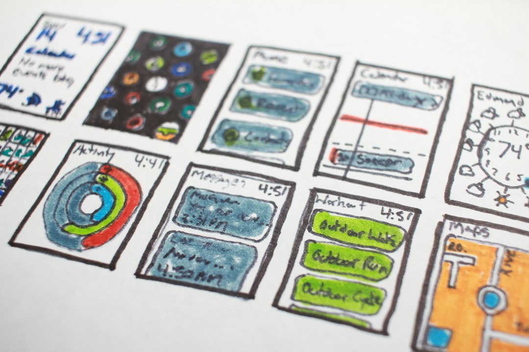
Step 2: Map the Timeline on Paper
Before you touch any tool, sketch it out. Literally, on paper or in a doc.
Write down every meaningful moment in the project:
- When you kicked off
- When you ran interviews or surveys
- When you hit a wall
- When you tried something weird and it failed
- When you got buy-in from stakeholders
- When you shipped
- What happened after launch
Aim for 6–12 moments. Then cut the ones that don't advance the story. Yes, your weekly status meetings are technically part of the timeline, but no one needs to see them.
Step 3: Write the Content First
This is where most people go wrong. They start fiddling with design before they know what they want to say. Don't do that. Write the copy first, in plain language, before you build anything.
For each timeline node, write:
- A short title
- A 1–2 sentence summary (this is what shows on the collapsed view)
- A longer explanation (300–500 words, if the node expands)
- Any supporting media (screenshots, video, quotes)
Write like you're telling a coworker about the project. Then tighten it up.
Step 4: Choose Your Tool
You've got options here:
- Static images in Figma or Canva — Fast, but not interactive.
- A custom-coded page — Maximum control, maximum time cost.
- A no-code tool like Notion or Airtable — Decent structure, less visual polish.
- A dedicated timeline platform — Built for exactly this use case.
If you don't want to spend a week wrestling with layout code, a dedicated tool saves you real time. Timeline Creator is built for exactly this. It combines a built-in file library, rich media support, professionally designed themes, and collaborative editing, so you don't have to design a timeline from the ground up.
The AI-powered timeline generation feature is also worth a look if you're starting from a blank page — it can help you structure your content automatically, which is a nice shortcut when you've got eight nodes to write and no energy left.
Step 5: Build the Timeline
Once your content is written, drop it into your tool of choice. This is usually the fun part.
A few things to focus on:
- Spacing and rhythm. A timeline that's crammed edge to edge feels claustrophobic. Give it room to breathe.
- Consistent node design. Every node should feel like part of the same family.
- Media hierarchy. Screenshots are great, but 20 of them in one node is overwhelming. Pick the 3 that matter most.
Step 6: Test It Like a UX Project
You know how to test an interface. Do the same thing here. Send your timeline to a friend who hasn't seen the project and ask them to describe it back to you.
If they can't tell you what the project was about after 30 seconds, your hierarchy is off. If they're confused about what order things happened in, your structure needs work. If they get bored halfway through, your content is too long.
Step 7: Publish and Iterate
Your first version won't be your best. That's fine. Publish it, show it to a few people in your network, and update it as you get feedback. Portfolios are living documents. Treat them that way.
How to Present Specific UX Artifacts in a Timeline
One of the trickiest parts of building a portfolio timeline is figuring out where different kinds of UX artifacts belong. Here's a rough guide.
Research Findings
Don't dump all your interview notes into a node. Instead, place each key insight at the moment it changed your thinking. "After five interviews, we realized the problem wasn't onboarding but re-engagement." That's a story beat, not a research report.
Wireframes and Prototypes
Wireframes are usually boring to look at, but they're important because they show your thinking in an unfinished state. Group them into a "exploration" node rather than scattering them. Show 2–3 options side by side, and note what you learned from each.
Usability Test Clips
Short video clips from usability sessions are gold. They're concrete, human, and hard to fake. If a user visibly struggled with a flow, that 15-second clip does more than three paragraphs of description. Keep them short — 10–20 seconds is plenty for a portfolio.
Design Iterations
Before-and-after views work well here. Showing the messier early version next to the polished final version tells a story about refinement. Don't just show the polished output; that hides all the interesting work.
Metrics and Outcomes
If you have any numbers — conversion lift, task completion improvement, support ticket reduction — put them at the end. Even small improvements are worth showing. If you don't have real numbers (plenty of portfolio projects don't), be honest about it. Say the project was a concept and describe what you would have measured.
Design Tips That Make a Timeline Feel Professional
Even if your content is great, sloppy design will undercut it. Here are some practical tips.
Use a Consistent Visual Hierarchy
Every node should have the same structure. Title on top, one-line summary below, media after that. Predictable layouts help viewers scan faster and feel like they're in good hands.
Limit Your Color Palette
Two or three colors is usually enough. One primary, one accent, and a neutral background. Timelines that use every color of the rainbow look amateurish, even if the content underneath is strong.
Make the Timeline Scannable in 30 Seconds
This is the hardest one. Imagine someone scrolling past your timeline at high speed. What sticks out? If nothing does, rework your headline nodes so the most important moments pop.
Use Typography Deliberately
Big titles, smaller body text, generous line heights. Skip the novelty fonts. A good display font for headings and a clean sans-serif for body text will beat any fancy combination.
Test on Mobile
Half the people who review your portfolio will do it on a phone. Timelines are notoriously tricky on small screens — check that horizontal scrolling works, that nodes don't overlap, and that media loads quickly.
Common Mistakes to Avoid
Even experienced designers mess these up. Here are the ones I see most often.
Making every node the same length. If your timeline has 10 nodes and every one of them has exactly 400 words, it reads like a spreadsheet. Mix it up. Some nodes can be a single sentence.
Hiding the story behind clicks. Interactivity is great, but the main story should be visible without any clicking. Use expanded nodes for depth, not as the only way to see content.
Treating the timeline as a résumé. Bullet lists of responsibilities don't belong on a portfolio timeline. Tell a story with specific decisions and outcomes.
Skipping the messy middle. Portfolios that only show the finished product feel suspicious. Show the pivots, the failed experiments, and the awkward early versions. That's what makes you credible.
Overdecorating. Animated transitions, cursor effects, parallax scrolling — none of it helps if your content is weak. In fact, it makes weak content worse because it distracts from the story.
Not naming a target audience. Who is this timeline for? A design director? A recruiter? A cross-functional partner? Different audiences need different levels of depth and different kinds of evidence. Pick one primary audience and build for them.
Ignoring accessibility. Color contrast, alt text on images, keyboard navigation — these aren't optional. If you're presenting yourself as a UX professional, your own portfolio should be usable.
Why a Dedicated Tool Beats DIY for Most People
At some point, you have to decide whether to build your portfolio timeline from scratch or use a tool. Both are valid, but there's a tradeoff.
Building from scratch gives you full control. You can craft every pixel, tune every animation, and make something that no other portfolio has. The cost? Time. Realistically, a hand-coded interactive timeline takes 10–30 hours depending on complexity and how comfortable you are with code. If you're on a job-search timeline (and most people reading this probably are), that's a lot of hours you could spend on content instead.
A dedicated tool like Timeline Creator trades some of that control for speed. You get professionally designed themes, a built-in file library, rich media support, team collaboration features, and the ability to export to images, Word documents, or embeds for your site. For most portfolio use cases, that tradeoff is worth it.
A few scenarios where it makes sense:
- You're job hunting and need a portfolio updated this week. Tool wins. You can have a timeline live in an afternoon.
- You're building a portfolio for fun with a fully bespoke interaction. Custom code wins.
- You need to share the timeline with a client or team. A tool with collaborative editing is much easier than passing around a Figma file.
- You want to update the timeline every time you ship something new. A tool with templates and reusable elements saves you hours over time.
There's also a middle path: build your timeline in a tool, then embed it into a custom-designed portfolio site. You get the polish of your own site and the speed of a dedicated timeline builder.
Real Examples: What a Good Portfolio Timeline Looks Like
Concrete examples help. Here are three scenarios that show timelines working well.
The Redesign Story
A product manager at a startup redesigned the onboarding flow after months of support complaints. Her timeline went from "we noticed a spike in tickets" to "we ran 12 interviews" to "the first redesign failed testing" to "we cut the flow in half and shipped." What made it work: she showed the failed prototype, which made the final solution feel earned.
The Zero-to-One Launch
A designer and researcher worked together on a new feature that didn't exist before. Their timeline walked through discovery workshops, competitive research, first sketches, a low-fi prototype, three rounds of user testing, a scoped v1, and a public launch. What made it work: they tied each phase to a specific decision, so the timeline read like a decision log, not a highlight reel.
The Long-Term Product Evolution
A UX designer at a SaaS company tracked a four-year evolution of the dashboard. Instead of a single case study, they built a timeline with nodes for each major release and annotated the design rationale behind each shift. What made it work: it showed how the design philosophy evolved over time, which is exactly what senior roles want to see.
In all three cases, the timeline was doing the same thing a static case study couldn't: showing the shape of the process, not just the destination.
Using Timelines Beyond the Portfolio Too
Once you build a portfolio timeline, you'll probably notice other places the format works.
- Client presentations. A timeline is often clearer than a slide deck for walking through project history.
- Team retrospectives. When you're trying to understand why a project went well (or didn't), a timeline that captures key moments helps the team see patterns.
- Product roadmaps. If you're presenting a roadmap to stakeholders, an interactive timeline lets people drill into specific milestones.
- Company history pages. A visual timeline of how the company evolved is more interesting than a "Our Story" wall of text.
- Educational content. Teachers and students can build timelines for history units, and the interactive format tends to hold attention better than a textbook.
That's part of why a dedicated tool pays off. You'll reuse it more than you think.
Frequently Asked Questions
Do I need a separate timeline for every project?
Not necessarily. For most portfolios, one or two strong timelines are better than five mediocre ones. Pick the projects that best represent the work you want more of.
How many nodes should a portfolio timeline have?
Aim for 6–10. Fewer than six and the story feels thin. More than ten and it becomes hard to follow.
Can I use a timeline if my project was very short?
Yes, if there's still a clear arc. Even a two-week project can work if it has a beginning, a pivot, and an outcome. What matters is whether there's a story worth telling.
Should the timeline be the whole case study, or just an overview?
Either works. Some designers use the timeline as the top-level view and expand each node into a full case study. Others use the timeline as a standalone narrative. Pick whichever fits your portfolio structure.
How do I handle confidential work?
Redact sensitive details, blur screenshots, and describe the work at a conceptual level. Hiring managers understand NDA constraints. Being vague about a specific metric is fine; skipping the project is worse.
What if I don't have real metrics?
Be honest. Say it was a concept project or that the metrics are estimated. Then describe what you would have measured and how. That shows you understand how success would be defined, which is useful on its own.
Is it okay to use a template?
Absolutely. Templates are a starting point, not a shortcut. The content is what makes the timeline yours.
How long should the timeline page be?
As long as it needs to be, as long as every node earns its place. If a node doesn't advance the story, cut it.
Final Thoughts
Portfolios are competitive. Recruiters and hiring managers see hundreds of them. If yours looks like everyone else's, you're relying on your work alone to stand out — and even great work gets skimmed if it's presented in a boring way.
An interactive timeline changes that dynamic. It gives your story a shape, puts the process front and center, and creates a more engaging experience for anyone reviewing your work. It also demonstrates that you think about presentation as part of design, which is exactly the kind of instinct hiring managers are looking for.
If you want to try building one, Timeline Creator is a solid starting point. The freemium model means you can test-drive it without paying anything, and the built-in themes, media support, and AI-assisted generation take a lot of the fiddly work off your plate. Whether you use it, build your own, or hack something together in Figma, the important thing is to start. Pick one project, map out the story, and build the timeline. Your portfolio — and your next interview — will thank you.
One last thing: don't wait for a "perfect" project to build a timeline. Use what you have. You'll learn more from shipping a version of the timeline than from planning it to death. Then iterate. That's the UX way, after all.
