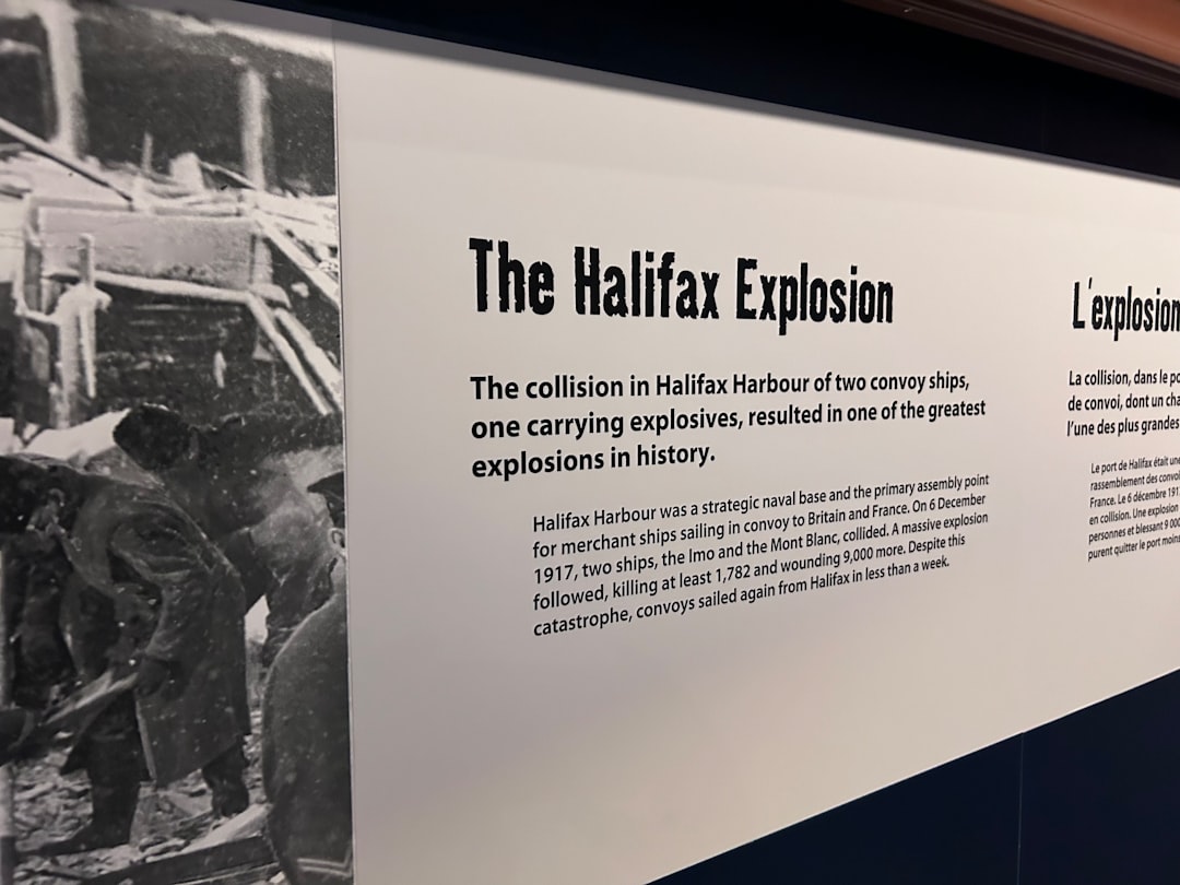
Have you ever tried to explain a complex sequence of events—maybe a decade-long corporate evolution or a messy historical era—and watched your audience's eyes glaze over? It happens to the best of us. We start with the facts, we list the dates, and we follow a linear path. But the human brain isn't exactly wired to process a dry list of dates in a vacuum. We crave patterns, connections, and a sense of momentum.
When we talk about "complex histories," we aren't just talking about the French Revolution or the rise of the Roman Empire. We're talking about any narrative where the "how" and "why" are just as important as the "when." A product roadmap for a software company is a history in the making. A family genealogy is a complex history. A project retrospective after a six-month sprint is a history. The problem is that most of us rely on text-heavy documents or static slides that fail to capture the movement of time.
Visual storytelling is the bridge between raw data and actual understanding. It's the difference between reading a list of ingredients and seeing a finished meal. By transforming a chronological list into a visual experience, you allow your audience to see the gaps, the overlaps, and the cause-and-effect relationships that make a story compelling.
But how do you actually do this without spending forty hours in a design tool you barely know how to use? Whether you're an educator, a project manager, or a historian, the goal is the same: make the complex feel intuitive. In this guide, we'll break down the mechanics of visual storytelling for complex histories and look at how tools like Timeline Creator can take the heavy lifting off your plate.
Why Visual Storytelling Matters for Complex Histories
Most of us were taught history through textbooks—columns of text interrupted by the occasional grainy photo. It’s an inefficient way to learn. When information is presented linearly in a text format, the reader has to do all the cognitive work of building a mental map of the timeline. They have to remember that Event A happened in 1920, Event B in 1925, and then try to calculate the distance and relationship between them.
By the time they get to Event C in 1930, they've likely forgotten the specific nuance of Event A.
Visual storytelling flips this. Instead of forcing the brain to build the map, you provide the map. When you use a visual timeline, you're providing a spatial representation of time. This allows the viewer to instantly grasp the scale of an era or the rapid pace of a specific period of change.
The Cognitive Load Theory
There is a concept in psychology called Cognitive Load Theory. Basically, our working memory has a limited capacity. When you present a complex history as a wall of text, you're overloading the viewer's cognitive load. They spend so much energy trying to organize the dates in their head that they have no room left to actually analyze the meaning of the events.
Visuals—specifically interactive timelines—offload that organization. Once the "where" and "when" are handled visually, the brain is free to ask: "Why did this happen?" or "What was the catalyst for this change?"
Moving Beyond the Static Slide
Many people think a few slides with bullet points count as visual storytelling. They don't. A slide deck is still a linear experience; you see one thing, then the next. True visual storytelling for complex histories requires a holistic view. The audience should be able to zoom out to see the "big picture" (the century or the decade) and then zoom in to see the "micro-moments" (the specific day or hour).
This is where interactivity becomes a game-changer. An interactive timeline allows a user to explore at their own pace, clicking into a specific event to see a video, a document, or a detailed description without losing their place in the overall narrative.
The Core Principles of Designing a Visual Narrative
If you just throw a bunch of dates onto a screen, you haven't created a story; you've created a chart. To move from "charting" to "storytelling," you need to apply a few design principles.
1. Establish a Clear Hierarchy
Not every event in a complex history is created equal. If you give every single date the same visual weight, you're telling the audience that everything is equally important. This leads to visual noise.
Instead, create a hierarchy:
- Anchor Events: These are the massive shifts. Think of them as the "chapters" of your history. These should be visually prominent—larger icons, bolder colors, or more significant markers.
- Supporting Events: These provide the context. They explain how the anchor events happened.
- Micro-Details: These are the "nice-to-know" facts. They should be tucked away in interactive elements (like a pop-up or a side-panel) so they don't clutter the main view.
2. Use Color as a Narrative Tool
Color shouldn't just be for aesthetics. In a complex history, color can represent themes, categories, or shifts in mood.
For example, if you're documenting a company's history, you might use:
- Blue for product launches.
- Green for funding rounds and growth.
- Red for pivots or crises.
When a viewer looks at the timeline, they can instantly see "The Red Era" (a period of struggle) and "The Green Era" (a period of expansion) without even reading the text. This is storytelling through color.
3. Embrace the "White Space"
One of the biggest mistakes in visual storytelling is the urge to fill every pixel. In a timeline, the space between events is just as important as the events themselves.
The gap between two points tells the viewer how much time passed. If you cram events together regardless of the actual time elapsed, you distort the history. Using a tool that respects temporal scale ensures that a ten-year gap actually looks like a ten-year gap, which helps the audience feel the "slow burn" or the "sudden crash" of a narrative.
4. Integrate Rich Media
A date and a sentence are boring. A date, a sentence, a 30-second video clip, and a primary source document are an experience.
Rich media allows you to provide evidence for your narrative. If you're talking about a "pivotal breakthrough" in a product's history, don't just say it—show the original sketch or the first prototype photo. This adds a layer of authenticity and emotional resonance that text alone cannot achieve.
Step-by-Step: Transforming Raw Data into a Visual Timeline
Moving from a spreadsheet of dates to a polished visual narrative can feel overwhelming. Here is a practical workflow to get it done without losing your mind.
Step 1: The Brain Dump and Curation
Start by listing every single event you think belongs in the history. Don't filter yet. Just get it all out. Once you have the master list, start the "culling" process.
Ask yourself: If I remove this event, does the story still make sense? If the answer is yes, move that event to your "micro-details" list. Your main timeline should only contain the narrative arc.
Step 2: Identify the "Turning Points"
Look at your curated list. Where are the shifts? Where did the trajectory change? These are your anchor events. Mark them clearly. These points will act as the emotional and structural pillars of your visual story.
Step 3: Grouping and Categorization
Assign themes to your events. This is where you decide on your color coding. Should you group by department? By geographical region? By project phase? Categorization helps the viewer track multiple threads of a story simultaneously.
Step 4: Choosing Your Tool
This is where most people stumble. You can try to build a timeline in PowerPoint or Canva, but you'll quickly realize those tools aren't designed for chronological data. You'll spend more time fighting with alignment and spacing than you will on the actual story.
This is why a dedicated platform like Timeline Creator is a better bet. Instead of manually drawing lines and boxes, you input your data, and the tool handles the spacing, the themes, and the interactivity. The AI-powered generation feature can even help you structure the initial draft, which is a huge time-saver when you're dealing with hundreds of data points.
Step 5: Iteration and Feedback
A visual narrative is rarely perfect on the first pass. Share your draft with someone who doesn't know the history. If they can follow the "arc" of the story without your explanation, you've succeeded. If they get lost or confused, you know exactly where you need to add more context or adjust the hierarchy.
Practical Applications Across Different Industries
Visual storytelling isn't just for historians. It's a versatile tool that solves specific problems across various professional domains.
In Education: Making History "Stick"
Students often struggle with the abstract nature of time. When a teacher says "the 18th century," it's just a number to a 14-year-old. But when they see an interactive timeline where they can click through the Enlightenment and see the immediate ripple effects of the industrial revolution, the history becomes a lived experience.
Educators can use timelines to:
- Compare Parallel Histories: Show what was happening in Asia and Europe at the same time to highlight global connections.
- Cause-and-Effect Mapping: Link a specific event (like a treaty) to its eventual outcome (like a war) using visual connectors.
- Student-Led Projects: Instead of a traditional essay, have students build a timeline. It forces them to synthesize information and decide what is truly important.
In Project Management: Managing Stakeholder Expectations
Stakeholders generally don't want to read a 20-page Gantt chart. They want to know: Where are we? What happened? What's next?
A visual timeline transforms a project roadmap from a technical document into a strategic narrative. By using a tool like Timeline Creator, a PM can present a "Company History" or a "Product Evolution" that shows the logic behind the current direction.
Key use cases include:
- Post-Mortems: Mapping out a project's timeline to identify exactly where a bottleneck occurred.
- Roadmap Presentations: Showing the evolution of a feature set over the next 18 months.
- Onboarding: Giving new hires a visual "history of the company" so they understand the culture and the milestones that shaped the organization.
In UX Design and Product Development: Mapping the User Journey
UX designers often deal with "user histories"—the sequence of actions a user takes over time. While a user flow is a map of possibilities, a timeline is a map of actuals.
By mapping the history of a product's iterations, design teams can:
- Track Feature Bloat: See exactly when a product started becoming too complex.
- Analyze User Feedback Loops: Map a customer complaint to the specific version of the product and then to the subsequent fix.
- Present Design Evolution: Show stakeholders how a concept evolved from a rough sketch to a high-fidelity prototype.
Common Mistakes to Avoid in Visual Storytelling
Even with the right tools, it's easy to fall into traps that undermine your narrative. Here are the most common pitfalls and how to fix them.
The "Data Dump" Error
The biggest mistake is trying to include everything. When you put 50 events on a single screen with equal weight, you've created a "wall of dates."
The Fix: Use the "Anchor and Support" method described earlier. Hide the granular details inside interactive elements.
The "Linear Trap"
Some people assume that history is always a straight line. In reality, histories are often cyclical or overlapping. If you force a complex, multi-threaded history into a single, thin line, you lose the nuance.
The Fix: Use swimlanes or categorized tracks. This allows you to show three different things happening simultaneously while still maintaining a chronological flow.
Ignoring the "So What?"
A timeline that only lists dates is just a calendar. The "story" part of visual storytelling is the interpretation of the data.
The Fix: Add context. Instead of just "1998: Company Founded," use "1998: Company Founded in a garage with $500 and a dream." Give the events meaning.
Over-Designing the Visuals
It's tempting to use every flash, bang, and color available in a design tool. But if the visuals distract from the data, the tool has failed.
The Fix: Stick to a professional theme. Use a limited color palette. Let the structure of the timeline provide the "wow" factor, not the number of gradients.
Comparison: Static Timelines vs. Interactive Timelines
If you're still debating whether to move away from traditional documents or slides, here is a breakdown of the differences.
| Feature | Static Timeline (PDF/Slide) | Interactive Timeline (Web-based) |
| :--- | :--- | :--- |
| Information Density | Low (too much text clutters the page) | High (details hidden in pop-ups/modals) |
| User Engagement | Passive (reading) | Active (exploring/clicking) |
| Scalability | Poor (hard to add new events) | Excellent (easy to expand and edit) |
| Contextual Depth | Limited to a few images/sentences | Unlimited (videos, links, full documents) |
| Accessibility | Static file, requires manual sharing | Embeddable URL, accessible via browser |
| Cognitive Load | High (user must organize data) | Low (structure is provided) |
Advanced Techniques for Complex Narratives
Once you've mastered the basics, you can start using more advanced techniques to make your histories even more compelling.
Creating "Narrative Arcs"
Every great story has a beginning, a middle, and an end. Even a corporate history should follow this.
- The Setup: The early days, the problem that needed solving.
- The Struggle: The pivots, the failures, the "dark night of the soul."
- The Resolution: The breakthrough, the growth, the current state.
When you build your timeline, look for these phases. You can actually visually group these sections using background colors or "era markers" to tell the viewer, "We are now entering the Growth Phase."
Using Contrast to Highlight Change
One of the most powerful ways to tell a story is to show "Before" and "After."
In a visual timeline, you can do this by placing two events in close proximity and using contrasting colors or images. For example, show a photo of the original 1980s office next to a photo of the modern HQ. The visual contrast tells the story of growth more effectively than any paragraph ever could.
The Power of "Zooming"
If you're using a tool like Timeline Creator, take advantage of the ability to dive deep. Start your presentation with a high-level overview of the entire century. Then, "zoom in" to a specific decade, and then further "zoom in" to a specific week of a crisis. This mimics how humans naturally process information—moving from the general to the specific.
FAQ: Solving Common Visual Storytelling Hurdles
Q: I have too much data. How do I decide what to keep?
A: Use the "Three-Layer Rule." Layer 1 is the big picture (Anchor Events). Layer 2 is the context (Supporting Events). Layer 3 is the evidence (Micro-Details). If a piece of data doesn't fit into one of these three, it probably doesn't belong in the timeline.
Q: How do I handle events that happened at the same time but in different places?
A: This is where "Swimlanes" come in. Instead of one long line, create parallel tracks. For example, if you're documenting a global war, have one swimlane for the Pacific Theater and another for the European Theater. They share the same time axis, but the events are separated.
Q: Can I use these timelines for things that aren't "history"?
A: Absolutely. Timelines are perfect for future-casting. Use them for product roadmaps, project gantt charts, or even a "onboarding journey" for a new customer. Anything that happens in a sequence can be a timeline.
Q: How do I make sure my timeline is accessible to people with visual impairments?
A: Ensure your color choices have high contrast. Use clear text labels instead of relying solely on color to convey meaning. If you're embedding a timeline on a website, ensure the tool provides alt-text for images and is compatible with screen readers.
Q: Is it better to have a long, scrolling timeline or a series of shorter ones?
A: It depends on the goal. If you want to show the "epic scale" of a history, a long, scrolling timeline is better. If you are teaching a course with separate modules, a series of shorter, focused timelines is more effective.
A Walkthrough: Building Your First Complex History
Let's pretend you're tasked with creating a "Company Evolution" timeline for a 20-year-old tech firm. Here is how you would actually execute this using a professional workflow.
Phase 1: The Research (The "What")
You spend a week digging through old emails, interviewing the founders, and looking at old product versions. You end up with a messy list of 150 dates.
- Action: Open a spreadsheet. Column A: Date. Column B: Event. Column C: Significance. Column D: Media (link to photo/doc).
Phase 2: The Curation (The "Which")
You realize that 150 events is too many. You look for the "Pivot Points."
- Pivot 1: The day they changed their business model in 2008.
- Pivot 2: The first major acquisition in 2015.
- Pivot 3: The rebranding effort in 2021.
These become your Anchor Events. Everything else is either a supporting event or a micro-detail.
Phase 3: The Assembly (The "How")
You open Timeline Creator. You don't want to spend hours manually sizing boxes.
- You upload your curated list.
- You use the AI-powered generation to quickly organize the events into a logical structure.
- You select a "Professional Corporate" theme.
- You assign colors: Blue for "Product Milestones," Gold for "Awards/Recognition," and Grey for "Internal Shifts."
Phase 4: The Enrichment (The "Wow")
Now you add the "soul" to the timeline.
- For the 2008 pivot, you upload a screenshot of the original, ugly website.
- For the 2015 acquisition, you embed a short video clip of the CEO announcing the news.
- For the 2021 rebranding, you add a PDF of the new brand guidelines.
Phase 5: The Delivery (The "Where")
You don't just send a link. You embed the interactive timeline directly into the "About Us" page of the company website. Now, instead of a boring "Our History" paragraph, visitors can actively explore the company's journey.
Checklist for a High-Impact Visual Narrative
Before you publish your timeline, run through this checklist to ensure it's actually delivering value.
- [ ] The "Glance Test": Can a viewer understand the overall arc of the story in 10 seconds without clicking anything?
- [ ] Hierarchy Check: Are the Anchor Events visually distinct from the Supporting Events?
- [ ] Color Logic: Does every color represent a specific theme or category?
- [ ] Media Integration: Is there a mix of text, images, and videos to provide evidence?
- [ ] Temporal Accuracy: Is the spacing between events proportional to the time that actually passed?
- [ ] Clutter Control: Have you moved the "nice-to-know" details into interactive pop-ups?
- [ ] Call to Action: Does the timeline lead the viewer toward a specific conclusion or next step?
- [ ] Device Compatibility: Does it look as good on a mobile phone as it does on a 27-inch monitor?
Beyond the Timeline: The Future of Visual History
As we move further into the digital age, the way we record and share history is changing. We are moving away from "static records" and toward "living documents."
A living document is a timeline that evolves in real-time. Imagine a product roadmap that updates automatically as Jira tickets are closed. Imagine a historical archive that allows users to contribute their own memories and photos to a collective timeline.
The shift toward interactivity is not just about "looking cool." It's about democratizing information. When you make a complex history visual and interactive, you're removing the barrier to entry. You're allowing anyone—regardless of their prior knowledge of the subject—to step into the story and find their own way through it.
This is the real power of visual storytelling. It transforms the viewer from a passive recipient of information into an active explorer of history.
Final Thoughts: Stop Listing, Start Storytelling
The difference between a boring project update and a compelling narrative is the way the information is structured. If you continue to rely on lists, bullet points, and static slides, you're asking your audience to do the hard work of synthesis. In a world of shrinking attention spans, that's a risky bet.
Visual storytelling for complex histories isn't about "beautifying" data; it's about making the truth of the narrative instantly accessible. It's about showing the tension, the gaps, and the triumphs of a sequence of events.
Whether you are documenting a decade of scientific discovery, a company's rise to the top, or a student's exploration of the Industrial Revolution, the tools are now available to make that process painless. You don't need to be a graphic designer to create a visually stunning narrative. You just need a clear sense of your story's arc and a tool that handles the technical heavy lifting.
If you're tired of fighting with slides and spreadsheets, it's time to try a different approach. Head over to Timeline Creator and start transforming your raw data into a visual experience. Your audience will thank you for it.
